Mobile-Friendly Website Design in Kitsap: Why Local Customers Stay, Convert & Return
In today’s digital world, most people in Kitsap use their phones to search for local businesses, check services, read reviews, and make decisions on the spot. If your website doesn’t deliver a smooth mobile experience, you’re losing customers before they even scroll.
This article explains why mobile-friendly website design matters for Kitsap businesses, how it impacts user experience and search performance, and what practical steps local companies can take to improve mobile engagement and conversions.

In Kitsap and beyond, the way people access information has evolved drastically. With smartphones becoming an integral part of daily life, users expect websites to seamlessly adapt to their screens, irrespective of size or orientation.
This shift in consumer behavior underscores the necessity for businesses in Kitsap to adopt mobile-friendly web design strategies.
Why Mobile Traffic Matters for Kitsap Businesses
Smartphones now account for a majority of online traffic, meaning more than half of potential customers see your site first on a phone. Because of this shift, Google and other search engines use a mobile-first index when ranking sites, making mobile readiness essential for visibility and growth.
A mobile-optimized site isn’t just easier to use. It also keeps people on your pages longer, reduces frustration, and increases the chance that someone will call, visit, or buy.
Enhanced User Experience
Mobile-friendly websites offer an optimal browsing experience regardless of the device being used. They ensure that users can easily navigate through the site, find relevant information, and complete actions such as making purchases or contacting the business. A positive user experience leads to longer visits and repeat interactions, boosting customer satisfaction.
Improved SEO Rankings
Search engines like Google prioritize mobile-friendly websites in their search results. Having a mobile-responsive website can significantly impact search engine optimization (SEO) rankings, making it easier for potential customers in Kitsap to find your business online.
Local Business Advantage
For local businesses in Kitsap, mobile-friendly websites offer a competitive edge. Many users searching for services or products while on the go are more likely to visit businesses that have websites optimized for mobile. A seamless mobile experience enhances the chances of turning these users into loyal customers.
Decreased Bounce Rates
Non-mobile-friendly websites can be frustrating to navigate on mobile devices, leading to high bounce rates (visitors leaving the site after viewing only one page). A mobile-responsive design reduces bounce rates by presenting content in a user-friendly manner, encouraging visitors to explore further.
Core Elements of a Mobile-Friendly Website
Mobile-friendly websites need more than just a responsive layout. The best ones follow modern usability and SEO practices:
Responsive Design
Responsive web design is the cornerstone of mobile-friendliness. It involves designing the website layout to adapt seamlessly to various screen sizes. This approach eliminates the need for separate desktop and mobile versions of the site, simplifying maintenance and delivering a consistent brand experience.

Fast Loading Speed
Mobile users are often on-the-go and have limited patience for slow-loading websites. Optimizing images, minimizing code, and utilizing caching techniques can significantly enhance page loading speed, keeping visitors engaged.
Intuitive Navigation
Mobile-friendly websites should have a clear and intuitive navigation menu, ideally a simplified version of the desktop menu. Large buttons and easy-to-tap links make navigation effortless, enhancing the overall user experience.
Thumb-Friendly Interaction
Given that mobile users predominantly navigate using their thumbs, strategically placing important buttons, links, and interactive elements within easy reach enhances user engagement.
Streamlined Content
Mobile screens have limited space, making concise and focused content essential. Prioritize key information, use bullet points, and break up content into easily digestible sections for optimal readability.

Touch-Friendly Forms
If your website includes forms, ensure they are designed for touch interaction. This involves using larger input fields, checkboxes, and buttons, making it easy for users to complete forms on their mobile devices.
Practical Tips to Improve Mobile UX
Here are actionable best practices to start today:
- Design for touchscreens: Build interactions around taps, swipes, and gestures, not mouse clicks.
- Optimize images and media: Make images scale fluidly and load fast.
- Keep content short and scannable: Break long text into short paragraphs and use clear headings.
- Simplify menus: Stick with 4–8 top navigation items so users can find key info fast.
- Ensure forms are touch-friendly: Larger fields and buttons increase form completion rates.
How Mobile Readiness Helps Your SEO
Mobile-friendly design is now a ranking factor in search engines. When your content and site structure work well on phones:
- Search engines index and rank your content more effectively.
- Your visibility in local search improves.
- Users stay longer and bounce less — both positive signals to search engines.
Good mobile experience isn’t optional anymore — it’s a critical part of local SEO success.
Mobile Design vs Desktop-Only Site
A mobile-only approach is outdated. Today the best strategy combines content that works elegantly on phones and enhances for larger screens.
Responsive design allows one site to serve both needs without duplicates or redirects, helping you maintain a clean structure that Google prefers.
Mobile optimization is a key part of a complete web strategy, but it’s just one piece of the puzzle. For comprehensive insights on building a website that performs on all screens and drives long-term growth, check out our main guide on web design in Kitsap County.
Mobile-First Checklist for Your Website
Use this checklist to audit your site today:
✔ Responsive layout
✔ Fast load times on mobile devices
✔ Touch-friendly buttons
✔ Readable fonts
✔ Simplified navigation
✔ Clear contact buttons
Following these points makes your site easier to use and more visible in search.
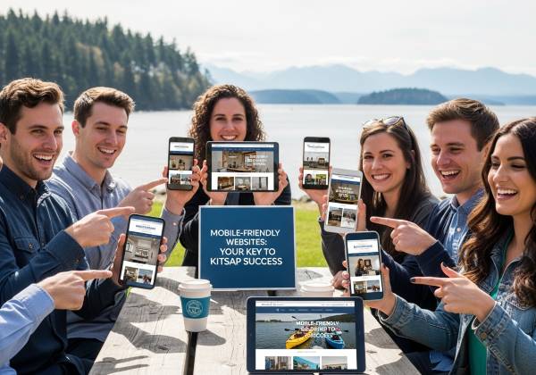
Finding Success with Mobile-Friendly Websites in Kitsap
In Kitsap, where a vibrant local business scene thrives, the importance of mobile-friendly websites cannot be ignored. By embracing a mobile-first approach, businesses can elevate their online presence, attract more visitors, and convert them into loyal customers.
Kitsap’s unique charm combined with modern web design practices can create a powerful synergy that drives growth and success for businesses of all sizes.
As the digital landscape continues to evolve, businesses in Kitsap must seize the opportunity to stay ahead. Investing in a mobile-friendly website isn’t just an investment in technology; it’s an investment in the future of your business. With the right web design partner, you can create a seamless online experience that resonates with the modern, mobile-savvy audience in Kitsap and beyond.
Mobile users are often ready to act, whether that’s calling, booking, or buying. Providing a smooth, fast, and intuitive mobile experience makes it easier for them to choose you. Investing in mobile-friendly website design today helps your Kitsap business stay competitive, rank higher, and grow revenue in the long run.